White House Press Secretary Sean Spicer’s famous “the largest audience ever to witness an inauguration, period” quote. Anthony Scaramucci’s telephone call to Ryan Lizza. The internet’s much loved BBC Dad. And don’t forget April the giraffe. Whilst the written word lays a strong foundation for context, visuals are what gives a story its true depth of field.

Image source: Photograph by Jabin Botsford / The Washington Post / Getty.
Visuals convey a much richer experience than text-heavy content alone. Imagine Lizza’s article without the photograph of “straight shooter” Scaramucci with his aviators on. Or reading about Dr. Robert E. Kelly’s (BBC Dad) “family blooper” without having watched the video. The results would be a story somewhat less impactful.
Along with the right combination of visual/s plus the written word, what these publications did right was knowing which visual would get the story across to their readers the best.
Some statistics
According to Google, consumer behaviour is changing. Readers are more in the know than they were before, and want information when they want it. With the average user visiting more than 89 websites per month (a 2010 statistic), and users having an average of 7 social media accounts, publishers should rethink the way they publish. Meaning, most publishers have dozens of regularly appearing features built for print, but not enough for their online, digital communities (if they have any). Journalists and writers should be hungry for change in the way in which they tell/report stories, how they publish, and how visual storytelling can add to their readers’ experiences.
Visual storytelling done well, can still be done better
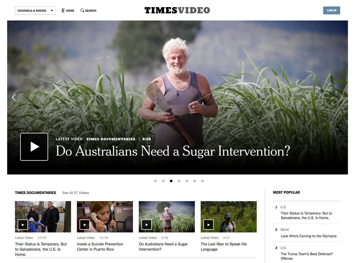
Take transformation giant, The New York Times, as an example. Taking Google’s consumer behaviour into account, its how-to guides section has been ever-expanding since its inception (plus it adds to the SEO experience too). From “How to Manage Your Career” to “How to Cut the Cord on Cable” - the guides are well written and accompanied by header GIFS and animated visuals. But some of their most powerful pieces to date include the interactive storytelling pieces on Simone Biles, President Rodrigo Duterte's brutal antidrug campaign, and more recently Deliverance From 27,000 Feet. Their storytelling doesn't stop there. Part of their (about) 200 pieces of journalism every day includes podcasts like The Daily, the evening briefings and creating video content for their website that easily resonates with news-craving viewers. But even though they’re embracing new digital formats to storytelling, they admit to falling short of fully utilising the power of visual storytelling. A report reads:
...not enough of our report uses digital storytelling tools that allow for richer and more engaging journalism. Too much of our daily report remains dominated by long strings of text.

Screen shot from Times Video on 2018-01-09.
Why? Storytellers and reporters sometimes rely too heavily, or too little, on someone else to do the visual thinking. And with photo editors, photographers and designers having their own processes of surveying images before final selection, a disconnect in what the storyteller wants to convey and what actually gets visually communicated, could develop. Or in some cases, a lack of visual storytelling altogether.
Publishers turn to technology for solutions
Like with many publishers, this disconnect can be easily solved with strengthened communication. Or more so, having an increased amount of to-and-fros between writers and visual experts to create stronger visual storytelling pieces before publication day. For example, having one hub where everything happens. Everything from layout to photo selection to editing and approval. As one reporter said:
It’s sort of demoralizing to know that your story could be stronger with the help of a graphic, but to also know that you will probably receive no help with it.
A solve? Software that can help revolutionize the way publishers publish to digital and print, and having one hub where assets can be sourced from. In an interview Matthew Gunn, Production Director at Yaffa Media, he stated that by using the right software for publication, their workflow processes have streamlined and reduced their production time from seven weeks down to three. Resulting in more time to sell. Something big newspaper giants, like The New York Times, are still struggling with:
Similarly, when we write about dance or art, our reporters and critics are able to include video or photography but only in a limited way; they lack the proper training to embed visuals contextually, and our content management system, Scoop, makes the placement of visuals an afterthought.
Creating new user experiences
With the reader intent to scout for the most relevant news and stories (on their average 7 social media apps and other platforms), excellent writing and journalism should be enhanced with visual storytelling to lure the reader in on digital platforms. Noting that, publishing on digital, should only happen when it can feed the storyteller’s hunger for a change in how they publish. Digital utilized well (even when not utilising it’s full power) provides the opportunity to create new reader experiences (e.g. The New York Time’s interactive pieces). It should also be used as such.
An example of visual storytelling on a social media platform like Instagram.
According to Cory Haik, Publisher for Mic, the new mixed-media formats in social video offer a rich opportunity to deliver complicated news in compelling ways. When talking about the visual revolution in journalism she adds:
I see short-form social video, and visually driven, mobile tap-through stories as much the same media...We’re still not exactly sure just how to create the same complicated narratives through visuals and motions. But that’s the opportunity.
Instead of seeing visuals as something supplemental to a story, publishers should be seeing visuals as a story on its own and find new ways to use these. The Professional Publishers Association (PPA), in an event on the power of visual storytelling, agrees. According to the association, when combined, text and media should add to the other, but also stand alone. Highlighting that publishers should not repeat in text what the visual media already shows. Re-use media, but in a different way than what you would (for example) in print or on other platforms.
Key considerations for successful visual storytelling
Visual storytelling can help make complex stories easier to understand and, as a result, deliver a more impactful message. It makes stories as imaginative, modern and relevant for readers as they could possibly be. Visual storytelling also presents publishers with an enormous opportunity–to expand their storytelling forms and establish themselves as media players with a mix of journalistic forms.
So what’s needed for successful visual storytelling, when looking at the big players:
- Be different on digital
- Use the right publication
- software (content creation and archive)
- Mix media forms Let visuals tell the stories.
Image credits:
Mount Sinabung, Indonesia header photo by Yosh Ginsu on Unsplash
Anthony Scaramucci photograph by Jabin Botsford / The Washington Post / Getty https://www.nytimes.com/video


